|
|
||||||
|
|

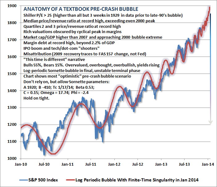
February 17, 2014 Topping Patterns and the Proper Cause for Optimism Just a note - I'll be speaking at the Wine Country Conference in Sonoma, CA on May 1st & 2nd, 2014, along with Mike "Mish" Shedlock, David Stockman, Stephanie Pomboy, Steen Jakobsen, Chris Martenson, Mebane Faber, Jim Bruce and others. This year's conference will benefit high-impact programming for individuals on the autism spectrum and their families, primarily local efforts through the Autism Society of America. As many of you know, my 19-year old son JP has autism, so the cause is very close to my heart. Last year's conference benefited the Les Turner ALS Foundation. It's a great event in a beautiful location. Hope to see you there. For more information, please visit www.winecountryconference.com. Thanks - John Following a moderate decline from its recent highs, the market experienced a “reflex” advance last week. As I noted in the February 3 comment, “Even the shallow 3% retreat from the market’s all-time highs may be enough to prompt a reflexive ‘buy-the-dip’ response in the context of extreme bullish sentiment here, as the S&P 500 bounced off of a widely monitored and steeply ascending trendline last week that connects several short-term market lows over the past year. Regardless, the potential for short-term gains is overwhelmed by the risk of deep cyclical and secular losses. We presently estimate prospective 10-year S&P 500 nominal total returns averaging just 2.7% annually, with negative expected total returns on every horizon shorter than 7 years.” Needless to say, our concerns are little changed by the last week’s advance, and with this low-volume reflex rally in place, we may observe a much deeper and uncorrected loss if the prior resolutions of severely overvalued, overbought, overbullish, rising-yield conditions are an indication. The expectation of impending market losses should certainly be tempered by the fact that similarly extreme conditions in February and May 2013 were largely uneventful, and were followed by further gains. Still, it’s important to recognize that extreme syndromes of overvalued, overbought, overbullish, rising-yield conditions have previously created risk and instability over a period longer than a few weeks or even months. Likewise, in the context of log-periodic bubbles – as we’ve observed in U.S. equities since 2010 (see The Diva is Already Singing) – the “critical point” or “finite time singularity” is not a crash date, but the inflection point from self-reinforcing speculation to fragile instability. Didier Sornette observed this more than a decade ago in Why Stock Markets Crash. Our best estimate of that inflection point remains about January 13. It’s also worth remembering that the “catalysts” associated with sharp market losses have often been fully recognized only after the fact, if at all. As Sornette emphasized, “The collapse is fundamentally due to the unstable position; the instantaneous cause of the crash is secondary.” The following chart is reprinted from our November 11, 2013 weekly comment A Textbook Pre-Crash Bubble. What is important, in my view, is not simply the log-periodic structure, but the broad array of additional classic speculative features that emerged as the market approached its recent highs.
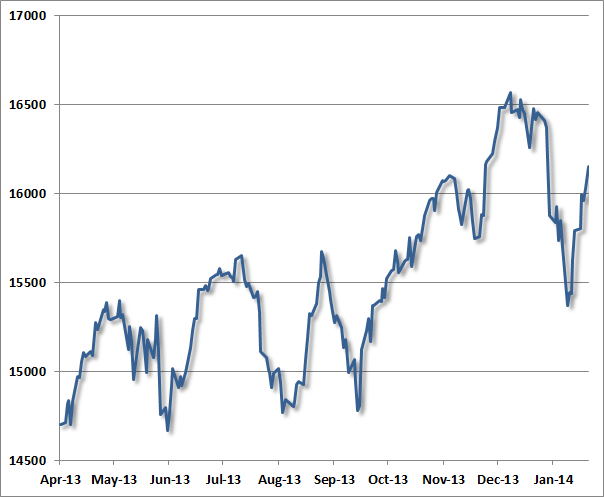
A few months ago, Bill Hester examined a century of price data, and observed that the non-overlapping periods most closely correlated with the past 5-year trajectory of the S&P 500 were the advances preceding the 2007, 2000, 1987, 1937 and 1929 market peaks. This shouldn’t be a surprise – the past 5-years have largely resembled a diagonal line, as did the advances to those extraordinary market peaks. Diagonal lines always have a nearly perfect correlation even if there is some amount of variation along the way. Again, we would dismiss historical analogs like this if the recent market peak did not feature the “full catastrophe” of textbook speculative features – particularly the same syndrome of extreme overvalued, overbought, overbullish, rising-yield conditions observed (prior to the past year) only at major market peaks in 2007, 2000, 1987, 1972, and 1929. The main temptation to ignore this concern is that similarly extreme conditions emerged in both February and May 2013 without consequence. Less extreme variants of this syndrome have also emerged periodically in the past few years (these variants also capture 1937 and a few other bull market peaks, as well as the April 2011 peak after which the market briefly retreated by nearly 20%). Overall, my view continues to be that the consequences of the more recent instances have not been avoided, but merely deferred – and those consequences will be worse for it. To offer some perspective of how major peaks have typically evolved, the following charts present the Dow Jones Industrial Average in the final advances toward, and the few weeks after, what turned out in hindsight to be major stock market peaks. For reference, let’s examine the recent market peak. Notice several features:
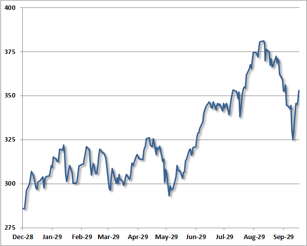
One can observe that same general dynamic in the chart below – a series of moderately-spaced peaks forming a largely sideways consolidation, a breakout to a steep and only briefly corrected speculative “blowoff”, an initial retreat, and finally a reflex rally. This chart depicts the final advance to the 1929 market peak.
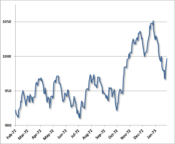
Largely the same dynamic was evident in the advance to the 1973 peak (after which the market lost half its value into late-1974): a series of moderately-spaced peaks comprising a broad consolidation, a breakout to a steep and only briefly corrected speculative blowoff and market peak, a steep initial decline, and a short-lived reflex rally after the peak.
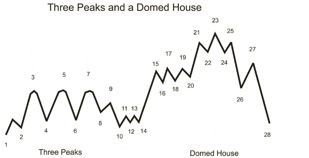
As it happens, the sequence described here is not at all new. Instead, it follows a pattern that technical analyst George Lindsay described in 1970 (and notably before even the 1973 instance above), which he called “Three Peaks and a Domed House.” Lindsay observed this pattern repeatedly across historical market cycles, describing about half of the bull market tops in the DJIA. My sense is that it is enormously ambitious to label 28 separate points in a technical pattern, but the central observations do appear to nicely characterize many historical instances. Lindsay called points 8-10 a “separating decline” that distinguishes the series of consolidating peaks from first vertical portion of the speculative blowoff (the “wall of the first story”). Following a choppy correction, the pattern completes with the “domed house” – which is roughly the analog of a narrow head-and-shoulders pattern: "after peaking at 25, price tumbles to 26, retraces to 27, before heading lower to 28, completing the pattern."
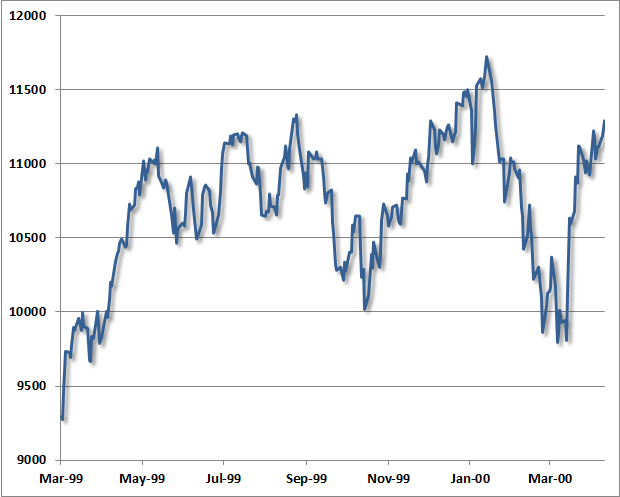
(chart and background h/t Claasen Research, James Goode, Thomas Bulkowski) Though the “separating decline” after the mid-1999 consolidation was quite deep, as was the initial decline from the January 2000 peak in the Dow Industrials, the same essential features were evident then as well. The correspondence isn’t nearly as pretty as in the present instance, or those of 1973 or 1929. It’s worth keeping in mind that despite a hard initial decline, many (though not all) historical bull market peaks include an “exhaustion rally” anywhere between 2-9 months after the market peak, which can carry prices within a few percent of the high. The problem is that there is too much variability to count on either their timing or extent.
From the standpoint of investor psychology, it seems understandable that the speculative enthusiasm and short-covering that contributes to bull market tops is fueled when the market “breaks out” after a period of consolidation (and what Lindsay called a “separating decline”). The blowoffs that followed – both recently and in the examples above – were accompanied by clear overvaluation on reliable measures, and also featured clearly defined overbought conditions and lopsided bullish sentiment. I’ll say this yet again, because it’s a crucial point – we would have zero interest in historical analogs like this if the recent market peak was not also accompanied by an extreme overvalued, overbought, overbullish, rising-yield syndrome that – prior to the past year - has emerged only at major market peaks. As with the recent log-periodic bubble, the pattern itself should be simply be treated like an interesting experiment. Lindsay’s and Sornette’s observations are largely consistent in that Lindsay’s pattern is basically a slightly irregular refinement of the very end of a Sornette bubble. The “three peaks” of Lindsay’s pattern correspond to log-periodic oscillations, and the left side of the “domed house” is essentially a final blowoff and short squeeze featuring much shallower fluctuations approaching the high. Without tracing through over a century of price data for every instance (including "setups" that did not follow through), we can't say categorically that this pattern is always followed by market losses. What one can say is that when Lindsay’s pattern has been accompanied by rich valuations (say, a cyclically adjusted P/E over 18), the market has typically been at the cusp of a significant retreat. Those periods of rich valuations are easily identified, and the corresponding blowoff patterns emerge in 1901-02, 1906, 1929, 1937, 1961, 1966, 1969, 1972-73, 1987, 1998, 2000, and today. The 2007 peak had less fidelity to Lindsay’s pattern because the reflex rally in October slightly exceeded the July peak of that year. Of course, lopsided bullish sentiment – as we observed in December and January – further narrows the set and worsens the average outcome, as do razor-thin risk premiums on corporate debt, soaring margin debt, and severely overbought conditions following a largely-uncorrected multi-year market advance. It’s not any single pattern that concerns us here, but rather the entire syndrome of classic speculative features that accompanied the recent peak – in the words of Zorba the Greek, “the full catastrophe.” In any event, our present investment outlook certainly doesn’t derive from or rely on such patterns, and are much more related to a broad ensemble of evidence that we can validate over a century of market data. As I’ve noted in numerous prior weekly comments, 1929, 1972-73, 1987, 2000, 2007, and recent market highs belong to a rather exclusive group of instances featuring a similarly extreme syndrome of overvaluation (based on normalized measures that are well-correlated with subsequent 7-10 year market returns, such as 10-year inflation-adjusted earnings, price/revenue, and market capitalization / GDP); overbought conditions (based on the extent and duration of price advances); strikingly overbullish sentiment (based on the proportion of advisory bulls versus bears over a period of weeks); and typically rising interest rates (for example, 10-year Treasury yields above their level of 6 months prior). Regardless of the patterns that have emerged in recent months, it’s important to recognize that the implications of extremely overvalued, overbought, overbullish conditions are not necessarily immediate. In 2000, the March high was followed by a series of retreats and recoveries, with a marginal new high in total-return terms as late as September 2000 before the market lost half of its value. In 2007, the August high was followed by an initial retreat and recovery into a very marginal final peak in October 2007 before the market lost half of its value. In 1972-73, an initial decline of nearly 20% from the market peak was followed by an advance in October 1973 that brought the S&P 500 and Dow Industrials within 7% of their highs before completing a near-50% market loss. In contrast, the reflex advances from the 1987 and 1929 peaks were rather short-lived, and were followed by steep losses within a span of weeks. Market cycles often display regularities, but investors should never conclude that they follow precise rules. The Proper Cause for Optimism To the extent that we are concerned and defensive about the prospect for steep equity market losses over the completion of this market cycle, we are also encouraged and optimistic about the prospect for strong investment opportunities that we expect to emerge as a result. Similar optimism for improved investment opportunities was certainly vindicated following periods that shared features like the present – 1929, 1972-73, 1987, 2000 and 2007, not to mention many less extreme instances of overvalued, overbought, overbullish conditions. We currently estimate prospective nominal total returns for the S&P 500 of just 2.4% annually over the coming decade. With the 10-year Treasury yield at 2.8% and short-term yields expected to remain depressed for years, we expect the 10-year return from an equally-weighted portfolio of stocks, bonds, and cash to average only about 2% annually from current prices. Our optimism that better opportunities will emerge over the completion of the present market cycle is unbowed. That optimism demands that investors refuse to lock-in the prospect of dismal long-term returns, or surrender in the face of a deafening speculative refrain that has lured others into the abyss throughout history. Meanwhile, we remain encouraged. Those who follow a historically-informed, value-conscious, and risk-managed investment discipline should be among the most optimistic investors in the financial markets. It’s just that this optimism is about future opportunities rather than present ones. Notes to the FOMC The following are a few observations regarding Dr. Yellen’s testimony to Congress. The objective is to broaden the discourse with alternative views and evidence, not to disparage FOMC members. We should all hope that Dr. Yellen does well in what can be expected to be a challenging position in the coming years.
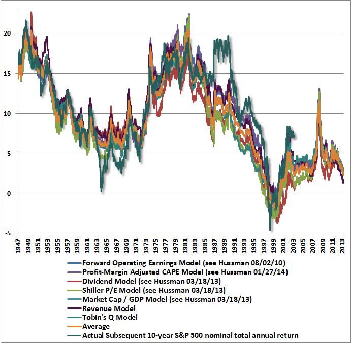
The chart below shows how these measures are related with actual subsequent 10-year total returns in the S&P 500. The specific calculations are detailed in a variety of prior weekly comments (the price / revenue and Tobin’s Q models are straightforward variants of the others).
The primary beneficiary of QE has been equity prices, where valuations are strenuously elevated. QE essentially robs the elderly and risk-averse of income, and encourages a speculative reach for yield. Importantly, one should not equate elevated stock prices with aggregate “wealth” (as higher current prices are associated with lower future returns, but little change in long-term cash flows or final purchasing power). Rather, the effect of QE is to give investors the illusion that they are wealthier than they really are. It is certainly possible for any individual investor to realize wealth from an overvalued security by selling it, but this requires another investor to buy that overvalued security. The wealth of the seller is obtained by redistributing that wealth from the buyer. The constant hope is to encourage a trickle-down effect on spending that, in any event, is unsupported by a century of economic evidence. The risks of continuing the recent policy course have accelerated far beyond the potential for benefit. The Fed is right to wind it down, and as it does so, the FOMC should focus on addressing the potential fallout from speculative losses that to a large degree are now unavoidable. Ultimately, the U.S. economy will be best served by a return to capital markets that allocate scarce savings toward productive investment rather than speculative activity. The transition to that environment will pose its own cyclical challenges, but is well worth achieving if the U.S. economy is to escape the grip of what is now more than 15 years of Fed-enabled capital misallocation. The foregoing comments represent the general investment analysis and economic views of the Advisor, and are provided solely for the purpose of information, instruction and discourse. Only comments in the Fund Notes section relate specifically to the Hussman Funds and the investment positions of the Funds. Fund Notes The Hussman Funds remain strongly defensive in the equity markets. We remain quite optimistic that the completion of the present market cycle will produce improved opportunities to accept risk in pursuit of far higher expected returns than appear likely at current valuations. We tightened our hedges in Strategic Growth considerably at the end of last week, as the “reflex” advance that we anticipated following the initial decline from the January highs has re-established overbought conditions on our measures. Strategic International remains fully hedged. Strategic Dividend Value is hedged at about 50% of its equity holdings, and Strategic Total Return has a moderately constructive – though not aggressive – position in Treasury securities and precious metals shares. --- The foregoing comments represent the general investment analysis and economic views of the Advisor, and are provided solely for the purpose of information, instruction and discourse. Prospectuses for the Hussman Strategic Growth Fund, the Hussman Strategic Total Return Fund, the Hussman Strategic International Fund, and the Hussman Strategic Dividend Value Fund, as well as Fund reports and other information, are available by clicking "The Funds" menu button from any page of this website. |
|||||||||||||||||||||||||
|
For more information about investing in the Hussman Funds, please call us at
1-800-HUSSMAN (1-800-487-7626) 513-326-3551 outside the United States Site and site contents © copyright Hussman Funds. Brief quotations including attribution and a direct link to this site (www.hussmanfunds.com) are authorized. All other rights reserved and actively enforced. Extensive or unattributed reproduction of text or research findings are violations of copyright law. Site design by 1WebsiteDesigners. |